Case Study
Website Usability Test
Code for America
Contract, Lead UX Writer
Summary
I conducted a semi-structured, moderated usability test for a high-fidelity Figma prototype to assess the overall user experience.
After presenting survey and tree test recommendations, I proposed a semi-structured, moderated usability test for a high-fidelity Figma prototype to assess the overall user experience. I recruited five volunteers to complete tasks. The tests uncovered confusion with copy, workshop offerings, and information. Based on these findings, I recommended redesigning the Workshops page to enhance clarity. The design and product teams enthusiastically embraced these changes, leading to a redesigned Workshops page, validated design systems, and a unified team focused on meeting milestone goals and enhancing user experience.
Situation
After presenting the survey and tree test recommendations, I proposed a study to assess the revised prototype's holistic experience. This approach aimed to create a general sense of usability before making further investments. Our objectives were to identify key performance indicators (KPIs) for the minimum viable product (MVP) and uncover any unmet user needs.
Task
I elected a semi-structured, moderated usability test for the high-fidelity, interactive Figma prototype.

Screenshot of the semi-structured task list and script.
Actions
The researchers and I recruited five volunteer participants through various Slack channels for the usability testing, which we conducted and recorded via Zoom. Each session lasted 60 minutes and involved a moderator, an offscreen notetaker, and (occasionally) 1-2 observers from our design and research teams.
We directed participants to complete three primary tasks: discovering the purpose of "Access the Data," signing up for a class, and finding out how to request more information. After each task, we asked structured questions about effort and ease, including opportunities for further discussion.
I chose to have participants think aloud to capture their thought processes and reactions, pausing sessions to probe where unexpected frictions or delights emerged.
Through discussions with the design and research teams, we identified the following data points to track during tests: task completion time, error quantities and types, and sentiment from verbal expressions.
After the sessions, we used FigJam to create affinity diagrams, synthesize user feedback, and analyze our data.
Finally, I facilitated an importance-difficulty matrix analysis with the team to prioritize the issues identified during the usability tests.

Screenshot of me performing a usability study with one of the hi-fi wireframe prototypes in Figma.
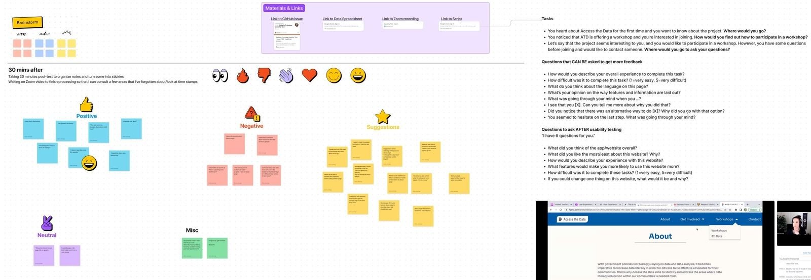
FigJam analysis and synthesis session.
Results
The usability tests revealed four primary areas of concern:
Confusing and complex copy.
Unclear concept of the "workshops" offering.
Conflicting information that prevented task completion.
The absence of supportive details affected user trust and understanding.

From my report deliverable: examples of participants' quotes regarding unclear copy.

An external link with no context, a significant source of confusion.
Outcomes
Based on these insights, I recommended significant changes, including the complete redesign of the Workshops page, focusing on accessibility, clarity in the educational modules, and improved calls-to-action to maintain user trust. These recommendations were enthusiastically received by the design and product teams, leading to the following:
A redesigned Workshops page with enhanced accessibility.
Design system validation and style guidelines aligned with user expectations.
Increased team unity around milestone goals, driven by a shared understanding of user needs and a commitment to addressing the identified issues for an enhanced user experience.